Sanguine: Drawing with Earth and Emotion
There’s something grounding and quietly powerful about drawing with sanguine pencil. The medium itself—born from iron oxide-rich clay—has been used by artists for centuries. It brings a warmth and weight that graphite simply can’t offer, and a kind of emotional resonance that makes it ideal for organic, expressive work.
I’ve primarily used sanguine pencil, which gives a bit more control than the softer sanguine stick or powdered versions. On most of these pieces, I used manilla or mixed media paper, both of which provide just enough tooth to hold the pigment without becoming too absorbent. For more refined work, I’d recommend toned paper with a smooth vellum surface or even pastel paper for deeper layering and blending.
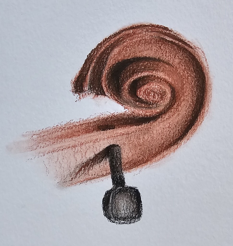
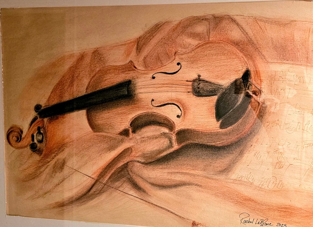
One of my favorite combinations is sanguine with black charcoal pencil. That contrast allows for more dramatic shadows and detail, while still keeping the overall tone warm and cohesive. In my violin head sketch, I used the charcoal pencil to deepen the interior spiral and tuning peg, while allowing the sanguine to create form and flow along the curves.
✍️ Technical Notes & Tips for Beginners
- Layer gradually. Sanguine builds best in light stages—press too hard, and it becomes muddy.
- Blend with care. I use my fingers and a blending stump interchangeably, but a kneaded eraser is essential for lifting highlights and softening edges.
- Sharpen frequently. The pencil tip dulls quickly, so keeping it sharp allows for better line variation and detail.
- Recommended brands: My go-tos are Conté à Paris and Cretacolor. They both offer reliable pigmentation and consistency.
- Pairing tip: Try using it alongside sepia or white chalk on toned paper for added dimension.
🎨 The Art & Its Process
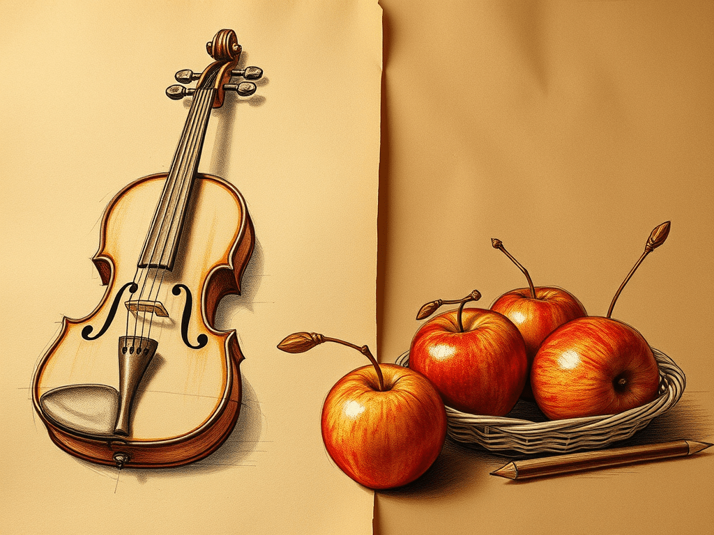
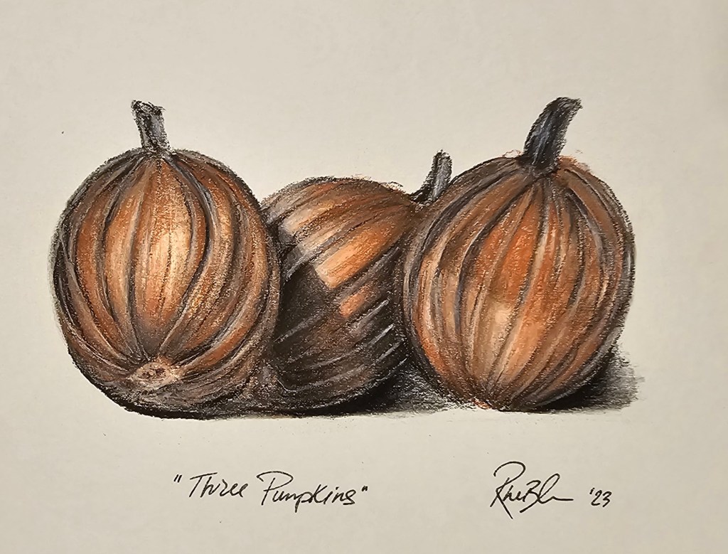
I often begin with a light contour sketch, keeping pressure minimal. I map out shadows first—especially in rounded forms like apples or violin bodies—and slowly layer in midtones and highlights. The violin on draped cloth was a full composition that required patience, especially in building the folds and creating the illusion of depth without overwhelming the paper.
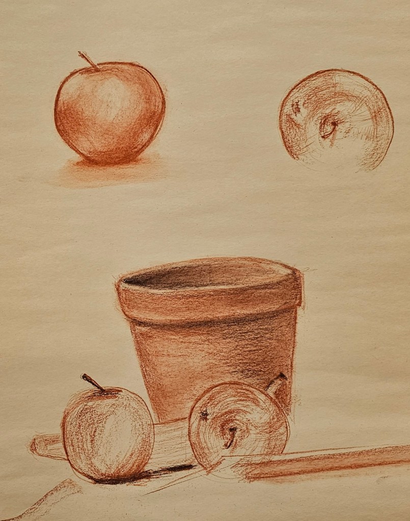
My still life with the terra cotta pot and fruit was an exercise in temperature and texture—the porous feel of the pot versus the smoother skin of the apples. Sanguine handled both with grace.
🧱 A Bit of History
Sanguine has roots in Renaissance drawing, where it was often used for figure studies, portraits, and anatomical sketches. Artists like Leonardo da Vinci, Michelangelo, and Jean-Auguste-Dominique Ingres relied on its expressive tone to render form, gesture, and warmth in their subjects. Its earthy color mimicked the human body, making it ideal for capturing subtle variations in skin tone and structure.
It’s a medium that feels honest—nothing flashy or synthetic. Just the natural grit of clay and the motion of your hand.
🗨️ Let’s Talk Art
Have you ever tried working with sanguine? What was your experience like?
Whether you’re a beginner curious about where to start, or a seasoned artist with tips of your own, I’d love to hear your thoughts. Feel free to share in the comments or ask questions—I’m happy to chat!

Leave a comment